Mozilla is launching its most important release of Firefox in a very long time today. After almost two years of working on its Australis redesign, the company is now finally ready to bring it to its stable release channel.
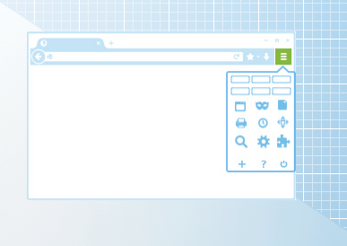
After loading it for the first time, chances are you’ll be slightly confused. This is Firefox’s most radical redesign since it moved to its rapid release schedule a few years ago. The new version looks significantly more like Chrome than the old Firefox. It features the same three-bar menu on the right and rounded tabs, for example. At the same time, though, it keeps the separate search form — something most other browsers have now done away with.
“The point of the redesign is to adapt the design to how modern users engage with the web,” Mozilla VP for Firefox Johnathan Nightingale told me earlier this month. In total, the team made 1,300 user interface and bug fixes since it first publicly introduced the Australis redesign about a year ago.
Users will likely pick up on the user interface similarities with Chrome, and some of those reactions might not be exactly positive, but Nightingale didn’t seem too worried about this. “Google didn’t invent simplicity,” he told me. “We do lots of things differently.”
The redesign, which touches many more aspects of the browser than just its user interface, is meant to give people the ability to fully customize their browsing experience. “Outside the core stuff, everybody uses the browser differently,” he noted. Some people, for example, never use the back button (which seems weird, but maybe they use keyboard shortcuts).

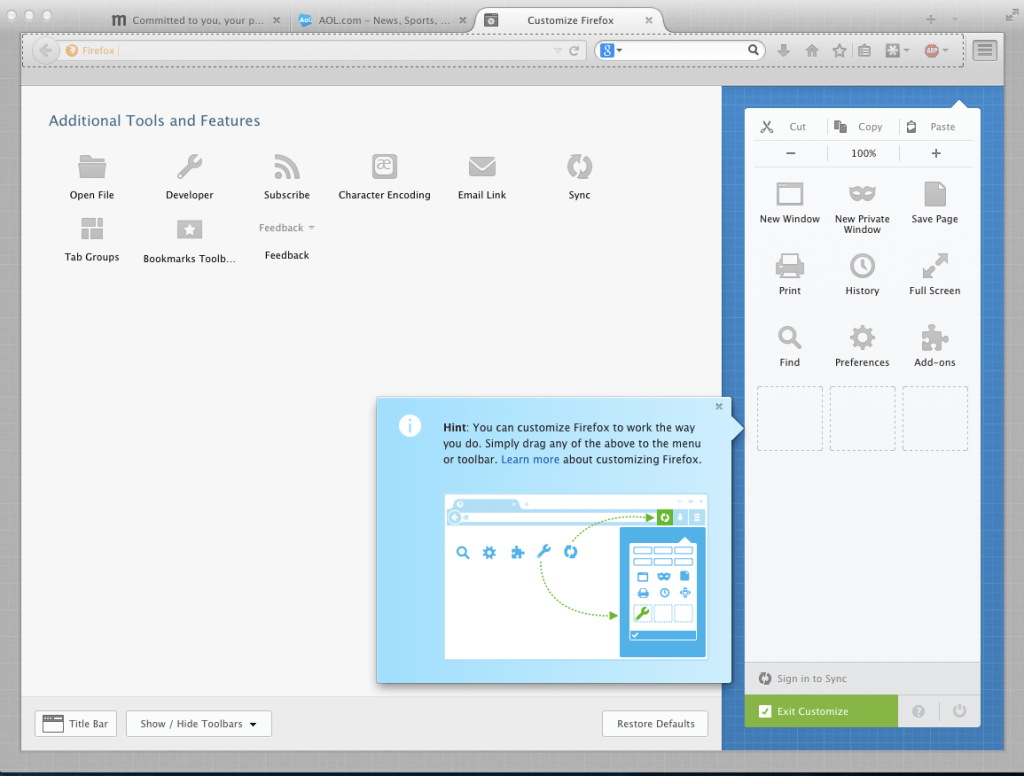
One of the main aspects of this release was to make the browser more customizable. Firefox always features extensive customization options, but those were always somewhat hidden, especially for mainstream users who may not always dig into the advanced menus of their browsers.
With this redesign, the “Customize” button is now always present in the new Firefox menu. After clicking on that button, the browser switches into the customization mode and you can then move around virtually all of Firefox’s user interface elements and organize the browser according to how they work with it. Customizing is now as easy as dragging and dropping elements to wherever you want them.
Other changes that are meant to adapt the browser to all kinds of types of users include the fact that Firefox now completely de-emphasizes unselected tabs. They basically fade in the background, which allows those of us with lots of open tabs (and maybe lots of app tabs, too), to focus on the ones we are looking at.
Besides these changes, Firefox now also features an improved bookmarking mechanism, which uses an almost un-Firefox-like animation when you star a page (the star then drops into the bookmark list button to show you where you can find it again).
As part of this update, Firefox now also uses Mozilla’s Firefox Accounts for syncing settings and bookmarks between machines. Instead of its rather arcane older syncing system, which mostly avoided using any cloud services for storing your information, the new system relies on Mozilla’s online services. Previously, Nightingale told me, many users didn’t even know Firefox had a built-in syncing feature — and those who did often didn’t use it simply because it wasn’t exactly easy to use. The new Firefox Accounts uses the usual combination of email and password instead of random codes.

Nightingale tells me that the team is already looking at how it can use Firefox Accounts in other parts of the application. The new accounts are obviously already integrated deeply into Firefox OS and it’s coming to Firefox on Android today, too.
Given its fast release cycle, why did it take Mozilla so long to release the redesign? It has been making the rounds in some form or another for about two years now, after all. Nightingale stressed that a lot of the earlier design was hardcoded, and in order to make the customization features work, the team had to rewrite large parts of the interface to make it more flexible. It had to test this, too, and in the end, it wanted to make sure that the new user tour Firefox users will see today worked well.
Mozilla is obviously going through an interesting period in its history. It’s trying to move fast into the mobile space and today’s release is one of its most important. At the same time, much of what it’s trying to do has recently been overshadowed by the discussion around the short CEO tenure of Brendan Eich. Today’s release will likely put the focus back on Mozilla’s main mission and product again, but this is also likely to be a somewhat controversial release.
No comments:
Post a Comment